
Product Photography Styling Tips + WHY It Matters
3/27/24
web design
product photography styling tips + why it matters
psa: your phone’s camera isn’t cutting it.
Your website photography plays a crucial role in showcasing your products effectively, communicating the look and feel of your brand, and driving those sales! Quality product photography can make or break your store's online success, especially as a small business. Standout imagery will not only showcase your goods in the best light possible but it also creates a sense of trust and credibility for potential customers — all of which will influence those buying decisions.
Soooooo whether you’re planning on hiring a professional photographer or doing them yourself, we’re sharing our top product photography tips and insights to get the absolute most out of your photos.
Types of Product Photography
Okay, okay, we’re starting with the basics here. There are two types of product photography and, spoiler alert, you definitely need a mix of both! There are lifestyle photos and product-focused imagery which is typically shot on a plain colored background. When designing your website, we want a mix of both lifestyle and product photos.
Lifestyle photography is going to help tell a story around the product while highlighting your product's features, benefits, and potential uses. It shows your products in a natural setting and how they can be integrated into real-life settings. An example of this could be a coffee brand showing a woman drinking coffee on her couch. In this scenario, you’re getting a glimpse at a product in action in real life so the customer can easily visualize themselves in that scenario. Showcasing how your products fit within your audience’s lifestyle is key to not only communicating the problem you solve and why they should buy them but it creates visual contrast among the simple product photography too.
Lifestyle photos are also going to be KEY to some great social media and email marketing along with helping your customers visualize the product IRL and how it fits into their lifestyle. Whereas product photos are going to simply show the customer what the product looks like. We recommend using simple or plain-colored backgrounds for product photography so that the photo is free from distractions and your audience can get a clear picture of what they’re buying. They’re also suuuuper important for keeping your product pages looking clean and are great to have on hand to feature in gift guides or other editorial content!
Styling Your Shots
It seems like a no-brainer but your photos, website design, and branding are all going to go hand in hand. This is why we always include image direction within our brand guidelines for client projects. Here we provide examples of on-brand imagery, cover what colors should be used within your imagery, the recommended lighting, and recommended subject matter. That way whether you’re taking your own photos or working with a product photographer, you have some guidance on what will look best with the overall feel of your brand.
Look at the colors of your branding, how can you implement them in a way that communicates the vibe of your brand? What type of lighting should you use? Your products will look the strongest on clean, well-lit backgrounds! If your product is white, consider using a contrasting background or element that will help your product stand out. Are your products fun and playful? Then consider using a fair amount of color and saturation. Should you play around with highlights and shadows to create a more refined setting? Answering these questions will help guide you when it comes to styling your photos and sourcing any necessary props.
Sourcing Props
We recommend simplifying the props and additional accessories within the background of your product shots. When it comes to our website design style, we often incorporate elements such as unique textured backgrounds or natural light to create a unique eye-catching photo.
However, there’s still a time and place for photo props! When sourcing things to style your photos with look for things that will bring height, interesting shapes, or colors that are in the branding color palette or that complement the brand. Think of small items that can fill empty spaces when needed — maybe that’s some flowers or greenery if you’ve got a more natural, sustainable brand or pops of confetti if your brand leans more playful. Plus, always consider the textures and surfaces you’re shooting on along with background colors. Can you add a marble tray to the mix or foliage to add texture?
Look for things that add to the branding and vibe vs. making it feel cluttered and overwhelming. Remember you want to compliment your products rather than take away from them! You want to use items that will help tell a story and remember to try to have fun, think a little outside the box, and use your imagination throughout the whole process!
Consider Variety
For individual product shots, consider highlighting a range of more detailed shots or close-ups as well as showing the product at different angles. For product collections, group photography can show a greater variety of the products you’re selling and how they look together as a whole.
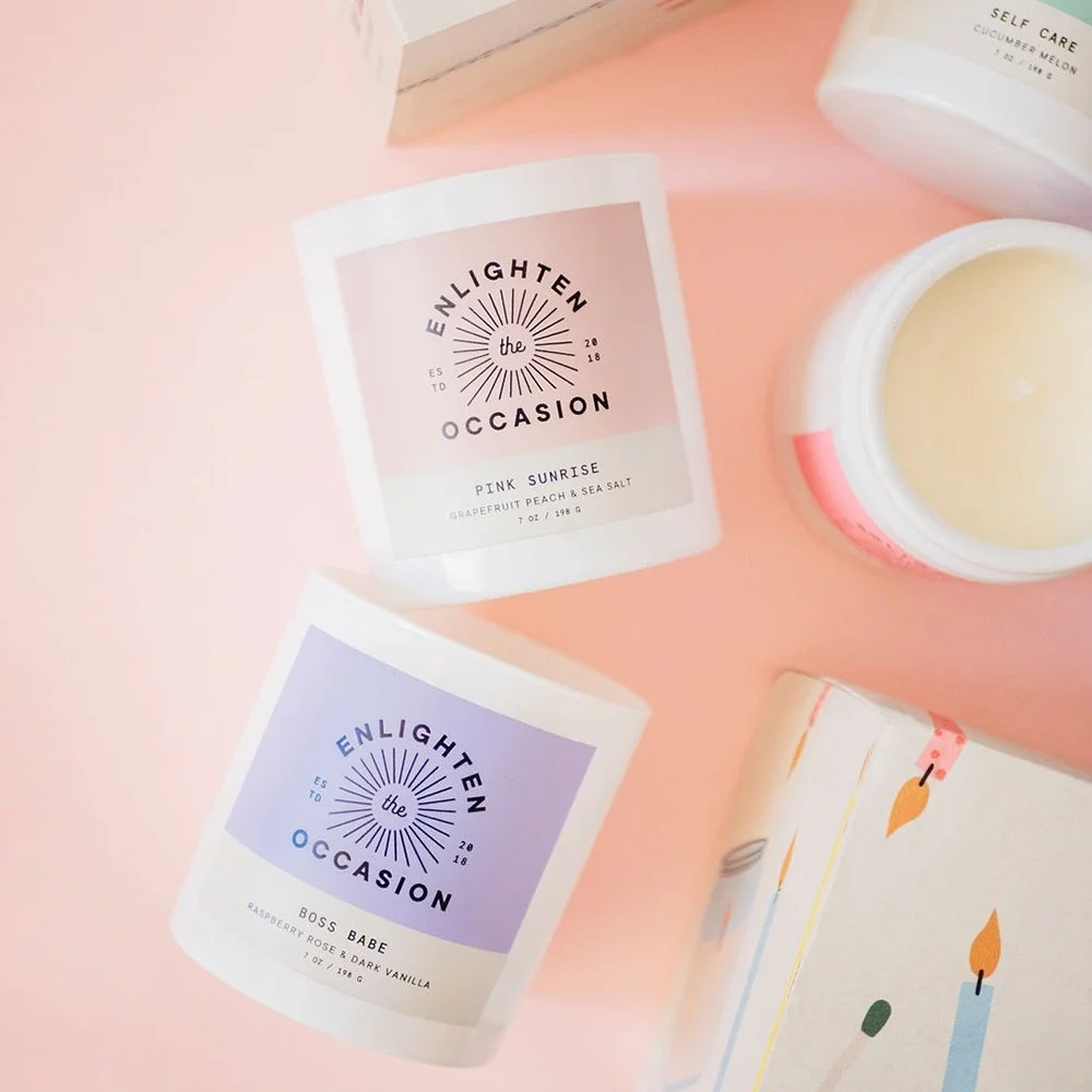
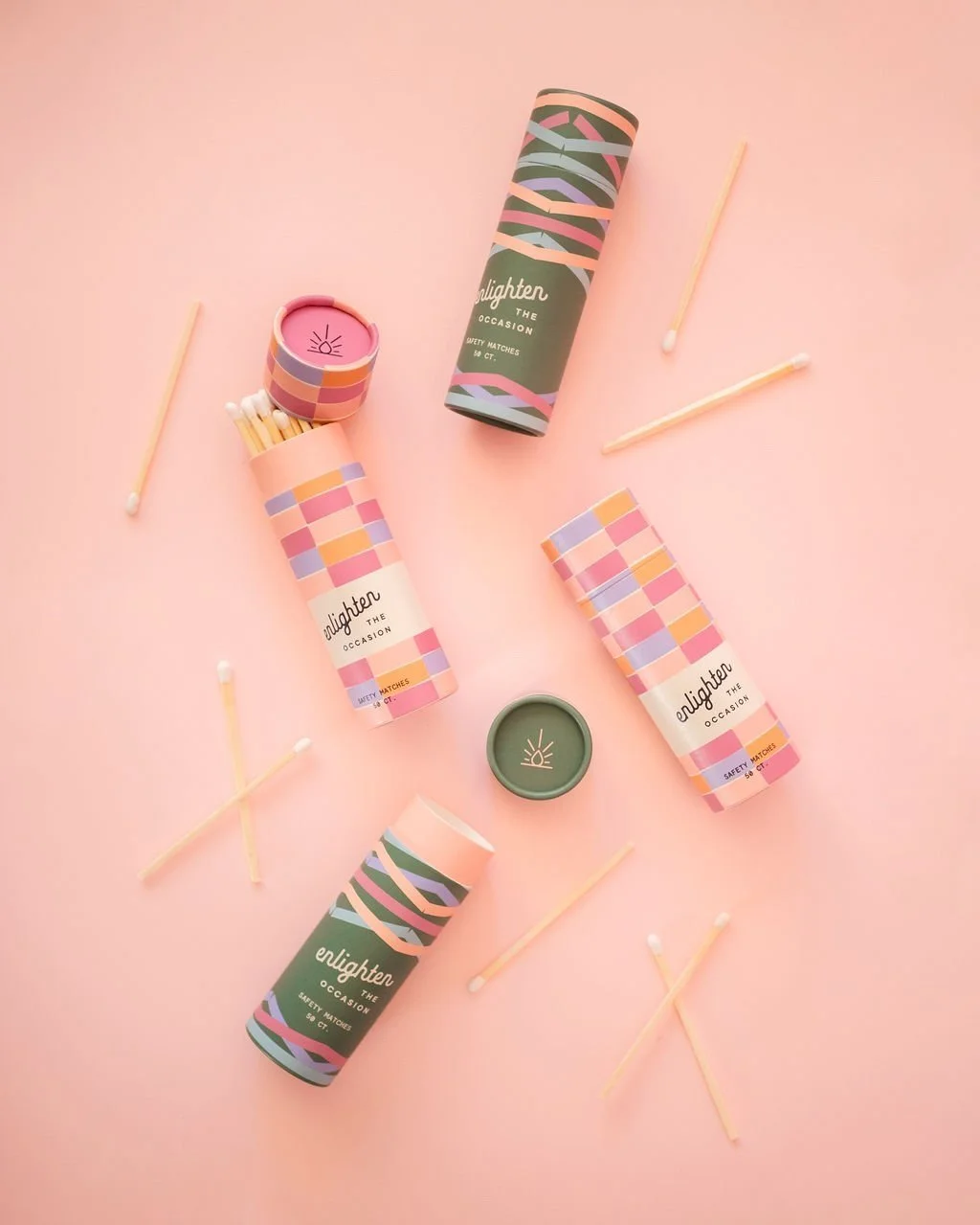
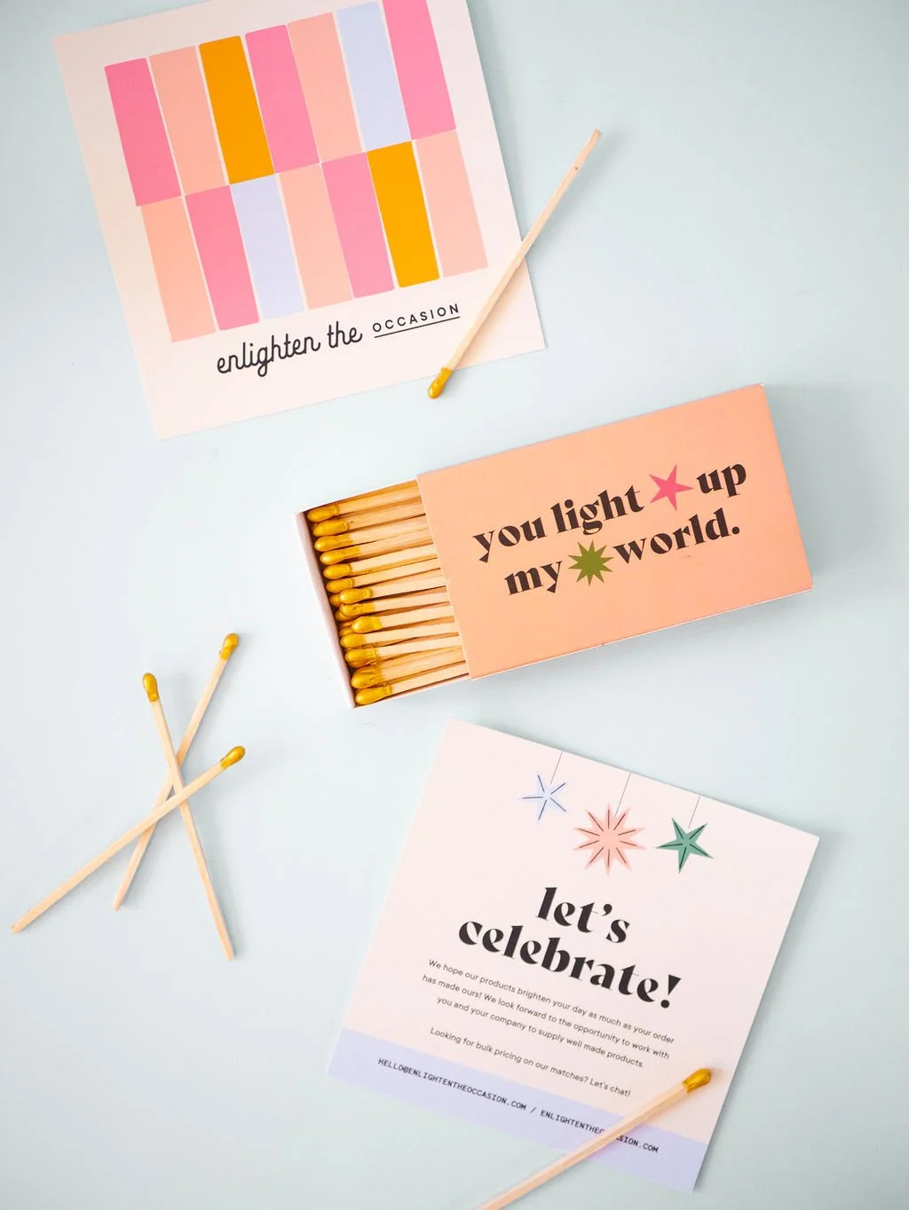
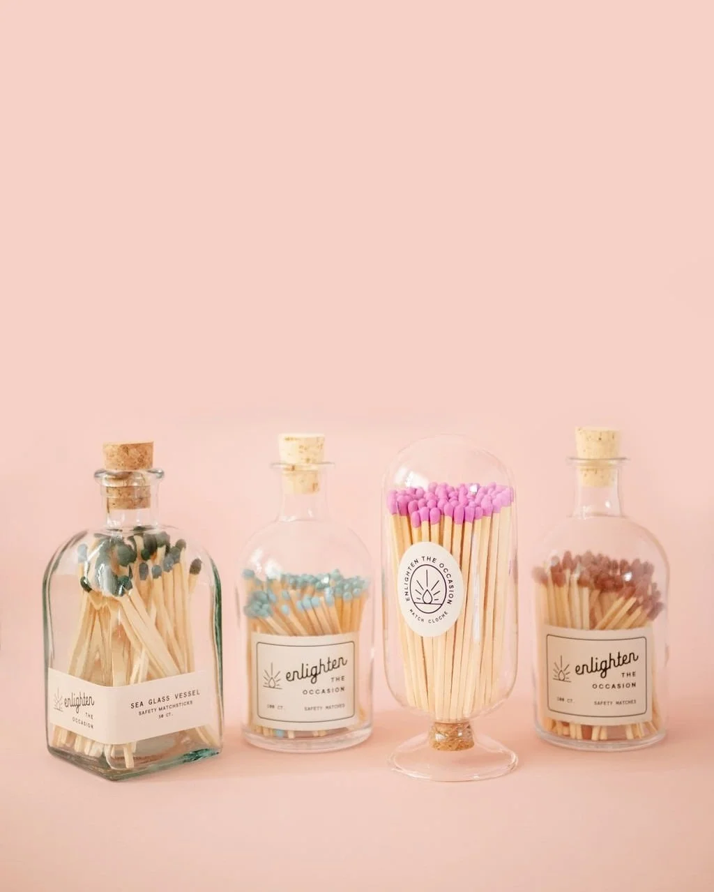
For Enlighten the Occasion, we laid out a few ideas for the client to create a variety of shots within her image direction. We recommended showcasing her packaging against clean, solid-colored backgrounds, including a few iterations of someone lighting a match, getting creative lining up the matches in unique, colorful ways, and showcasing matches on display on someone’s coffee table or in a celebratory setting such as a birthday party. With a large variety of photos to choose from and again, that oh-so-important mix of lifestyle and product-only shots, we’re able to use our expertise as designers to pull the images into an impactful and engaging site design that tells customers what the heck they’re buying and really picture those products fitting into their daily lives.
Avoid Mobile Photos
I know in this day and age it’s easy to feel confident in our photo abilities with the latest iPhone in hand, however, your audience is smart and can tell when a photo was shot by a professional and when it wasn’t. If you want your audience to invest with you, you have to invest in yourself and that starts with how your products are shown visually so one of my biggest tips is to avoid mobile photos altogether. I totally get it if you need to take a DIY approach but if that’s the case consider investing in a camera and even a course in product photography if you’re able to at the least!
Optimize for Web
Last but not least optimize your product photography for the web! This means proper sizing, resolution, and not having photos that take 100 years to load. When it comes to sizing, you want to upload the correct size of an image depending on how large it is on your website. For example, in Shopify, we recommend product photography that is 2048 pixels by 2048 pixels. We also recommend cropping all of your photos into a square so your audience isn’t scrolling through the product listing page with a mix of horizontal and vertical images. Keeping the same image ratio across your product photos is key for a clean and easy-to-use website. With that in mind, we typically recommend images to be 72 dpi in resolution so your site loads quickly. Any smaller than 72 dpi could result in pixelated or blurry images! Now you’re probably thinking, don’t large images slow my site down!? And the answer is yesssss, they do. That’s where compressing your image comes in. There are free online tools for this (check out jpeg mini!) or if you’re a Photoshop girly you can ‘save for web’ to find a great balance of file quality and size.
When optimizing your product photos for ecommerce you also want to be mindful when naming your files. Your file name can impact how images appear in Google search results and poorly named photo files can even break on some browsers aka your image won’t load or show up. With that in mind, all file names should be lowercase and only use letters and numbers. File names that contain special characters (aside from a hyphen) or spaces are the ones that tend to break so as a rule of thumb don’t include spaces or weird characters, okayyyy? A good example would be brightenmade-organicbrandingkit.
Once you upload your perfectly named and sized images, don’t forget about alt text! Alt text is used when an image can’t be loaded, is crawled by those infamous ‘bots’, and is what’s read aloud by screen readers. It’s a key part of SEO so you’ll always want to make sure you include relevant keywords and keep it descriptive.
I know that’s all A LOT of info but I promise it’s easier than you think AND is worth doing right. Great site design that CONVERTS is key to making those profit dreams a reality and we’d love to help!