
featured postsHOT TIPS, COOL BRANDS, AND A LITTLE LIFE STUFF TOO


Design Crushes in Des Moines
People love to say the midwest is lacking when it comes to design, and Iowa especially. As a proud Iowan, born and raised, I'm here to totes disagree. Des Moines might not be the most bustling city on the map, but there are spots here I've genuinely fallen in love with over the years. I rounded up a few of my faves.
7 questions your website should answer as a service-based biz
If your website leaves potential clients guessing, they’re probably clicking away. These are the key questions every service-based business website should answer to build trust, communicate value, and turn curious visitors into confident inquiries.
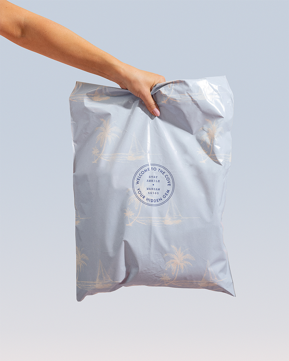
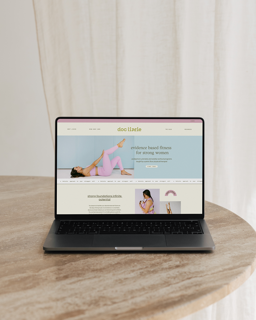
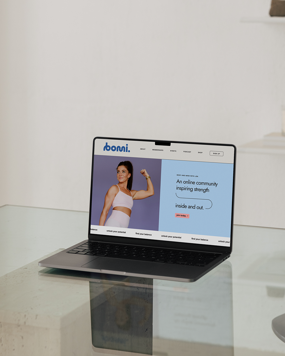
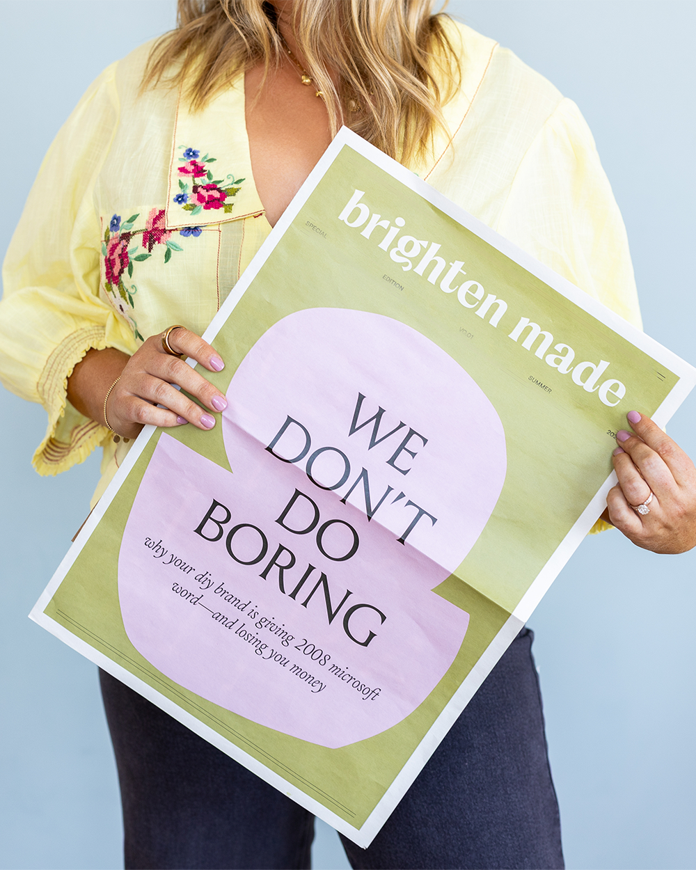
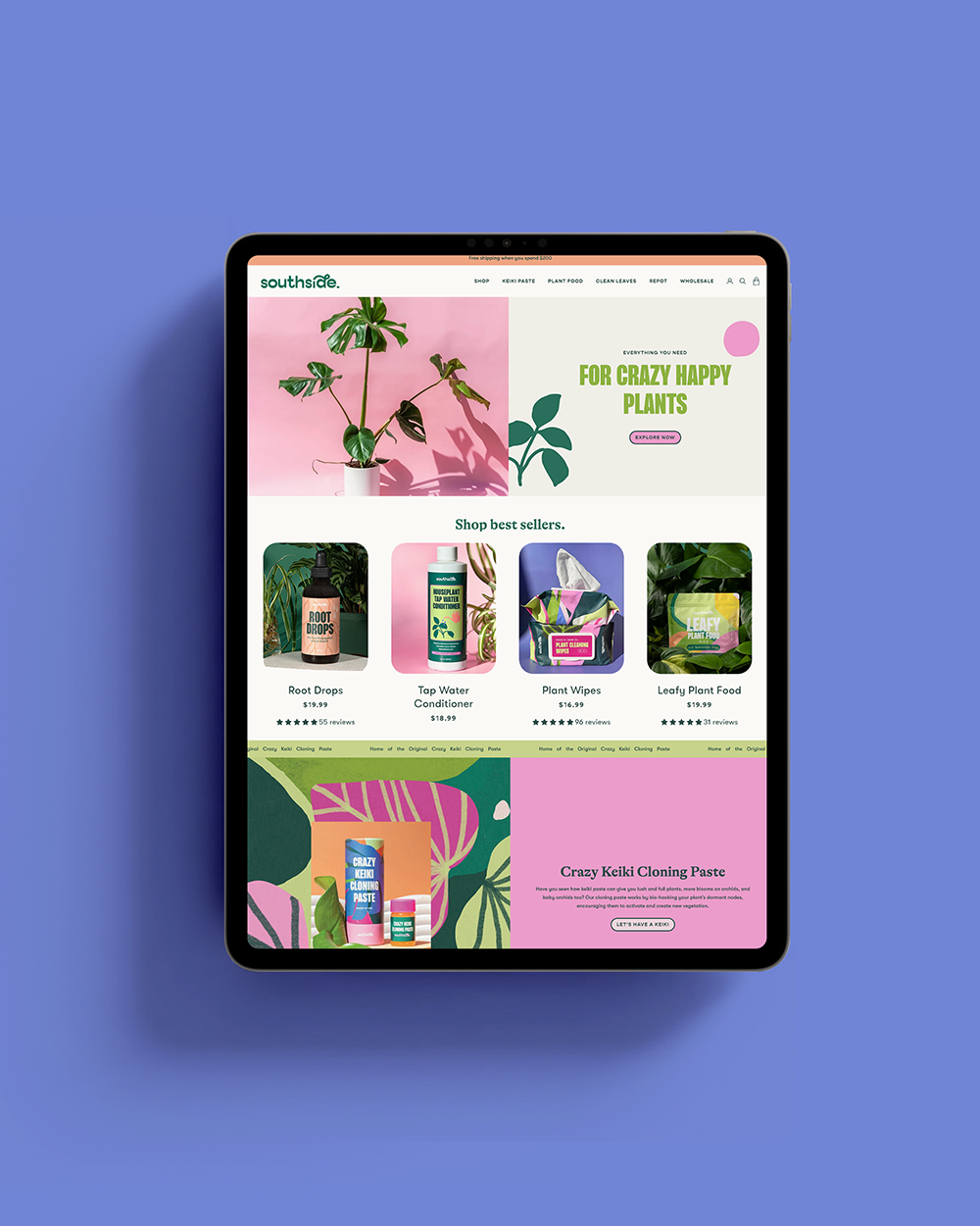
a case study: the cove
What began as a sub-brand evolved into a full rebrand and name change. See how we transformed Elysian Co. into The Cove — a modern, coastal boutique identity built around custom typography, hand-drawn illustrations, and a destination-driven brand experience.

How I Began Outsourcing in My Biz
When I became a mom, I honestly felt like I was being punked.
Before my daughter, I spent so much of my time working because I genuinely love what I do. My business felt like my first baby. But after having her, my entire world flipped upside down (in the best way). My heart was suddenly living outside of my body, and I just couldn’t — or honestly didn’t want to — work the same way I had been.
I remember thinking, what are other moms doing? How is anything getting done?
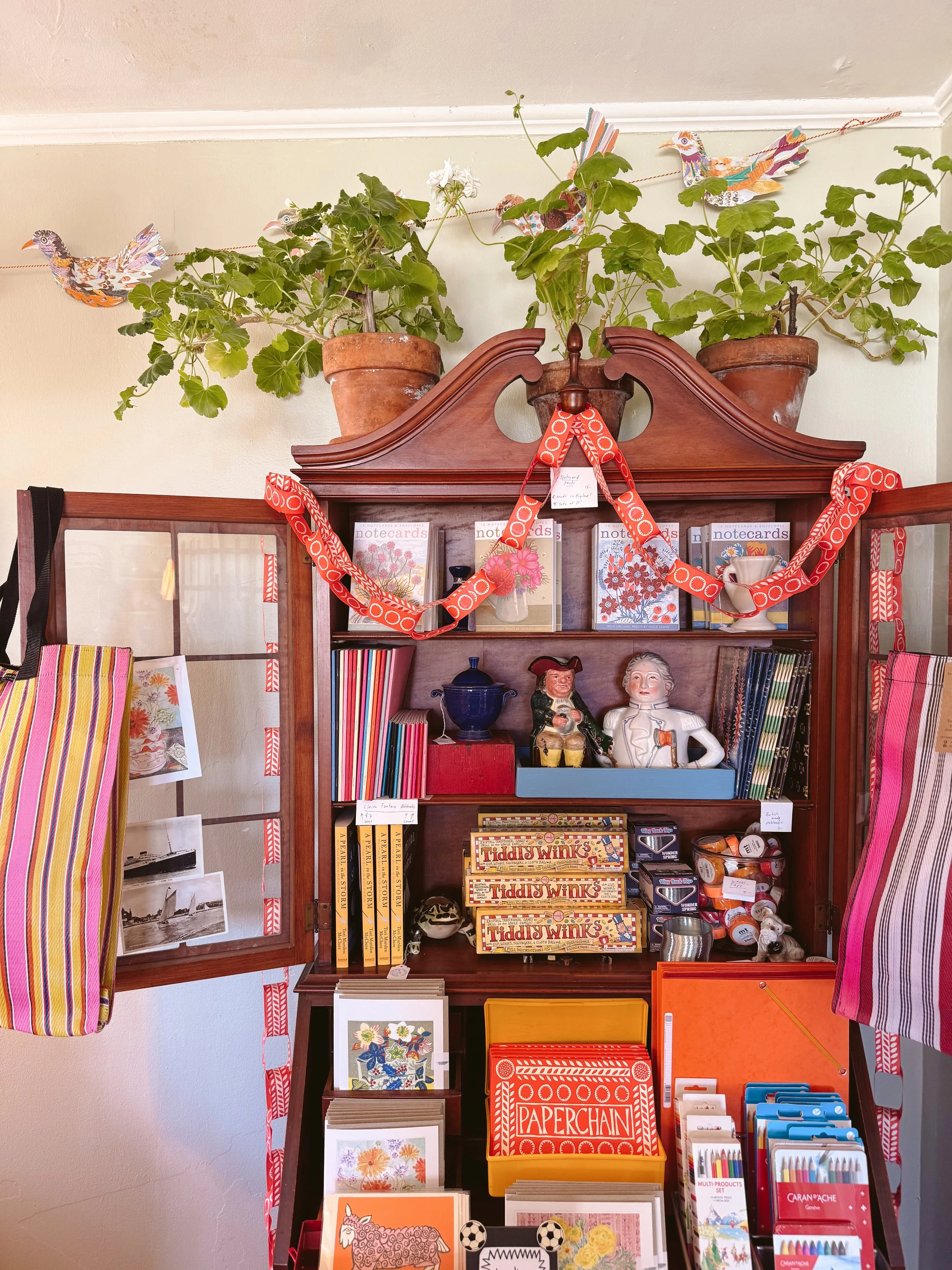
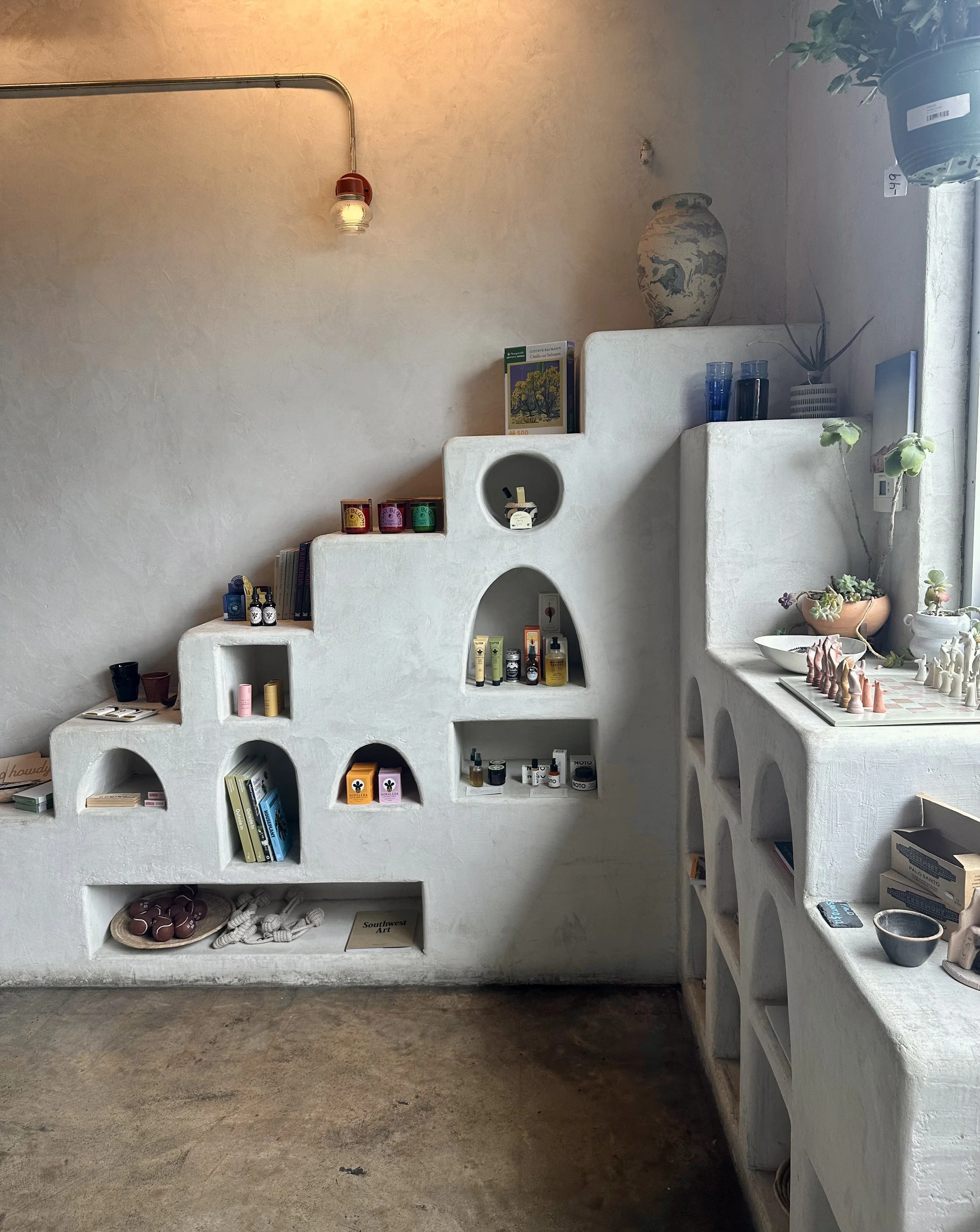
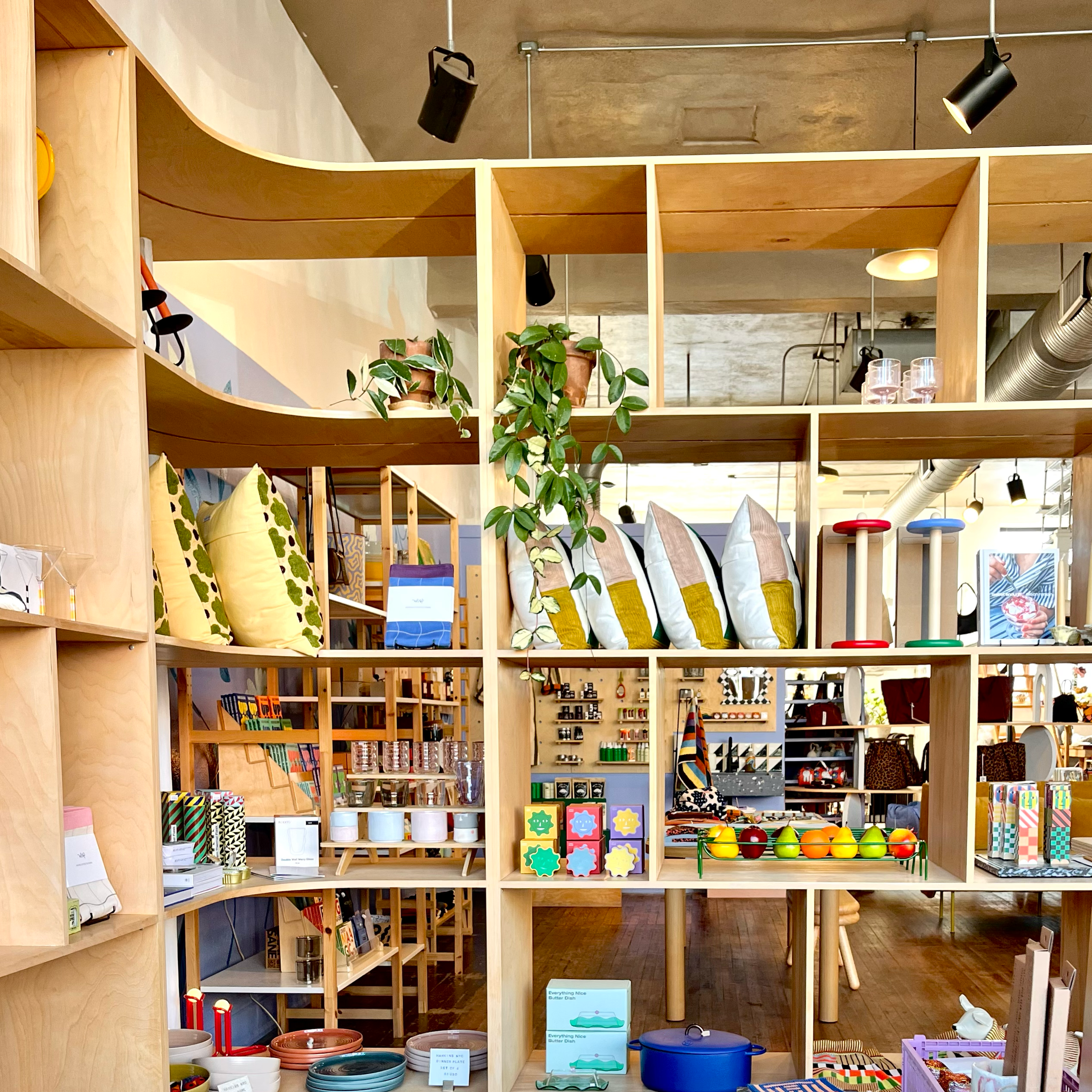
Eat Well, Shop Pretty: A Design-Lover's Guide to Austin, TX
Austin takes two things very seriously: good food and good taste. And the local business owners here are pouring into the details — the packaging, the signage, the fonts, the feeling of a space — in the best way possible.
From storefronts to shelves to menus with actual personality, Austin is full of spots that get good design.
why I disagree with my college professors
Design school taught me that vector is king, icons are everything, and perfection is the goal — but running a branding studio taught me something very different. In this post, I’m sharing what I’ve had to unlearn about graphic design, branding systems, and working with real clients after graduating with a BFA in Graphic Design.
how to choose an email marketing platform without spiraling
Choosing an email marketing platform doesn’t have to be complicated. In this post, we break down how your business model and website platform should guide the decision — why we recommend Flodesk for Squarespace-based, service-focused brands and Klaviyo for Shopify-powered e-commerce businesses. If you want email marketing that actually supports your website, sales, and long-term growth, this is where to start.
Kansas City is a design-lover’s dream
Kansas City has quietly become that girl when it comes to design. From packaging you want to keep forever to storefronts that stop you mid-walk, local businesses here are clearly paying attention to the details — and we love to see it. We rounded up some of our favorite KC spots creating (or curating) really good design. Think shelves, walls, menus, mugs, and everything in between.

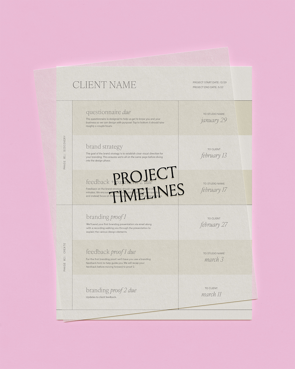
5 tips for better client communication (and a smoother project overall)
Clear client communication is the difference between smooth, confident projects and constant back-and-forth. In this post, we’re breaking down five essential habits that improve your client experience, set better boundaries, and help you lead projects with clarity — without overexplaining or burning yourself out.
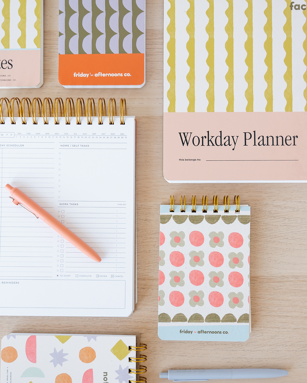
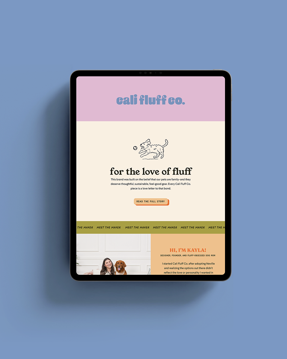
a case study: friday afternoons co.
Friday Afternoons Co. creates paper goods that celebrate intentional time, creativity, and the small moments that matter. As the brand prepared to scale, it needed a visual identity that felt playful yet organized, joyful but credible. We partnered to develop thoughtful branding, messaging, and custom collateral that finally gives the brand room to grow without losing its heart.
the fastest way to ruin your website
Random updates, off-brand tweaks, and “just because” decisions are the fastest way to wreck a good website. Here’s how to avoid the mistakes that make sites feel messy, inconsistent, and in need of a redesign ASAP.