3 Tips to Maximize Your Shopify Website Design
2/21/24
Education
three tips to maximize your shopify website design
calling all designers, if you’re not doing these three things when designing a Shopify site for your clients, you should be.
1 | Custom Slideshow Banners
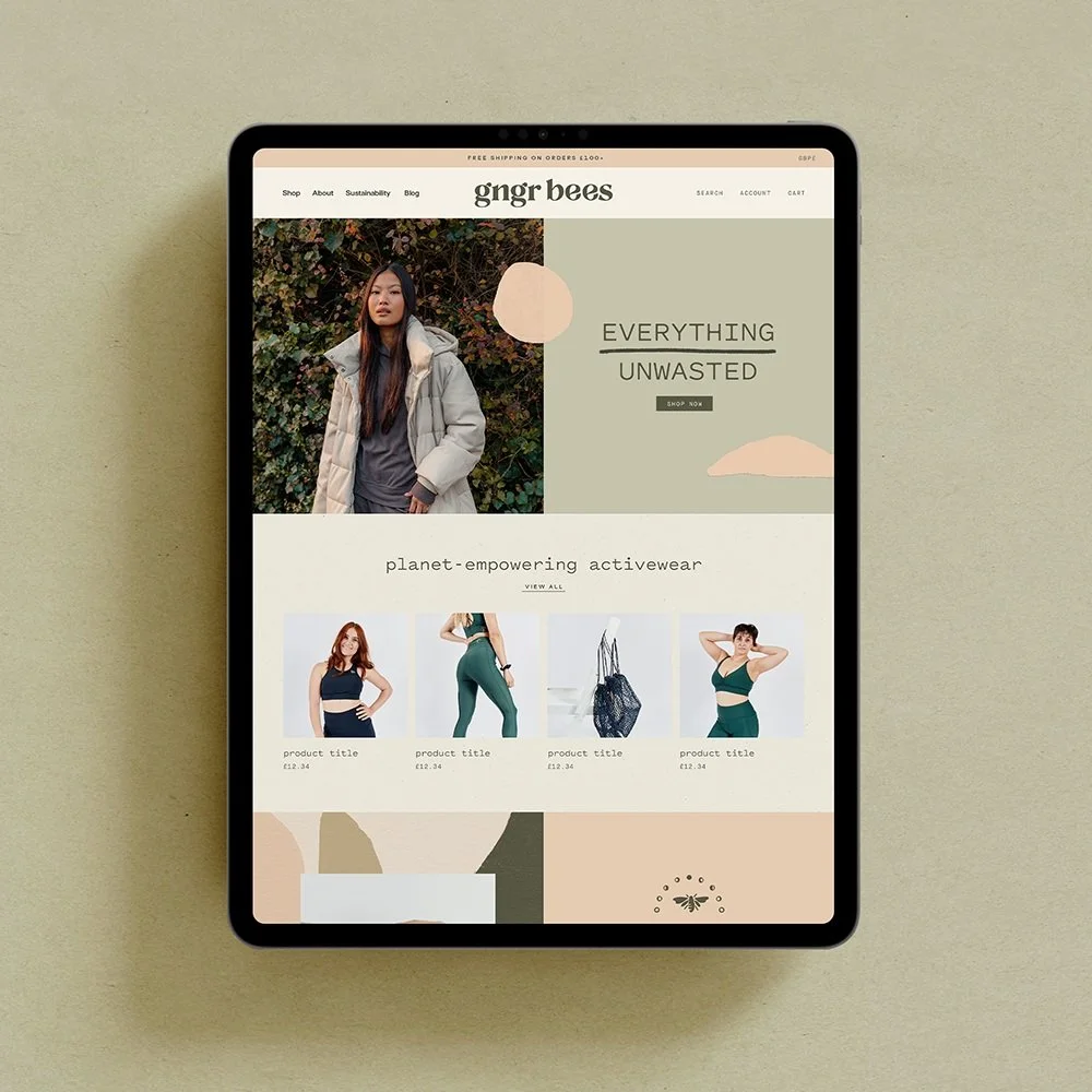
Create custom slideshow banners! The horizontal full-bleed photos rarely work unless you have product photos that fit within the wide ratio, especially when thinking about how responsive it is on mobile, too. Instead, I love making things look a bit more dynamic by creating editable banner graphics in Canva that my clients can easily update. We’re able to get a custom look by including patterns and artistic elements that are from their branding without the headache of updating it every time. This is great for seasonal promotions, too, and we can even create two different sizes of banners — one for desktop and one for mobile so that the user experience is 10/10 no matter where they’re browsing.
2 | Add Custom Fonts
A little bit of CSS can go a loooong way. Replacing all the standard fonts that come with a Shopify theme will make the site feel super custom. Check out our blog post here on how to upload your custom fonts! Personally, I like to take it a few steps further by targeting specific sections and adjusting the type styling to fit the space. If you’re new to CSS and the web design world, I highly recommend the courses Square Stylist + Standout Shopify. W3schools is also a great resource (along with our friend Google!). My web design and coding knowledge was slim to none when I first began my business and now I feel confident I can tackle almost any CSS challenge. So let this be inspiration that it’s never too late to learn!
3 | Image Direction
Images are EVERYTHING. Encourage your clients to do a brand photo shoot that aligns with their new colors and overall branding vibe. Within our branding process, we guide clients on the overall look and feel their website images should have to keep things cohesive. This empowers clients to keep things looking on-brand even as they update their imagery with new products. We love GNGR Bees website as an example of this! With each product launch, they’re consistent with their product photography and site imagery. They continually use images that are consistent with the brand vibe by leaning into bright photography with a natural feel and earth tones.


