
3 Tips to Nail Your Homepage Design
11/8/23
Web Design
three tips to nail your homepage design
sharing three things that will truly make a difference when it comes to your homepage design — scouts honor.
10/10 don’t recommend designing your own website — hi, that’s what we’re here for! But we also understand not everyone can hire a custom brand and website designer off the bat! So if you’re going the DIY route, here are three sure-fire tips that will help create an action-based site that will quickly resonate with your audience.
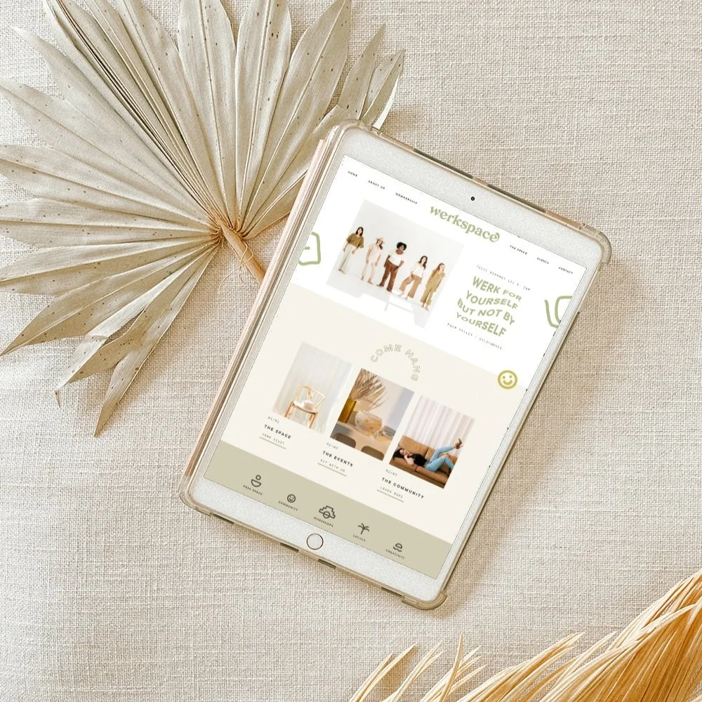
Tip 1 | Utilize Space Above the Fold
Studies have shown that the average person is going to spend three minutes or less on your website so you need to grab their attention, communicate your message, and sell them on your services or products all within that window — no pressure. The best way to do that is to use that first section on your homepage. The part of the homepage that shows up and is seen before anyone starts scrolling is known as above the fold. This is where you need to clearly state what you do and who you do it for right from the start. This is also a great opportunity to utilize SEO! We recommend putting the main headline in your H1 styling so that your site can tell Google the primary piece of text for that page.
Here at Brighten Made HQ, we love a good animation moment. What’s something catchy you could incorporate above the fold to draw the user in? Some of our go-tos look like animated gifs, animated text, or other moving elements to help engage the user.
We want to WOW them and excite them while also not overwhelming them. Remember balance is key when incorporating any movement or animation!
Tip 2 | Short and Sweet
Keep your text short and sweet! Remember, we’ve got like three minutes (or less!) to make an impact here. Use different heading styles and formats to break up information so it’s easier to digest. Can you use numbers to call out specific steps or actions you want to highlight? Can you use a bulleted list to make an impact? How can we split up these sections and utilize visuals to help convey your message?
When in doubt, less is more. Your audience is going to skim and only spend time reading the vital pieces of information that they’re looking for. Using headlines and subheadings to summarize various sections or what the text is about can help guide them seamlessly throughout your site!
Avoid long blocks of copy when possible. Nothing makes someone want to x-out faster than the blink of an eye when they see a giant body of text. You can always use collapsible tabs to share more information if the user wants to read more!
Tip 3 | Call to Actions
Call to actions need to be EVERYWHERE. There should be no dead ends on your site and your audience should be able to keep scrolling and clicking on the journey YOU set for them. This doesn’t mean you need every page linking to your contact page, but you do want to set forth a funnel within your own site based on how you draw your users' attention and where you prompt them to go next. Consider using your brighter colors from your brand color palette for the CTAs. This will help draw attention to the button, and in turn, help guide them on where you want them to go next.
Here’s an example — for site visitors who are on your about page, consider inviting them to learn more about what you offer by visiting the services page.
Your homepage should really be a brief overview of who you are and what you offer. Having your different offerings and service or product information broken out in a way that is easy to find and read will help the user get to where they want to be faster.
ALSO pro-tip: Not everyone starts on your homepage! If you get a lot of traffic from other places, like Pinterest, for example, you could rename your homepage to ‘start here’ so that you can have more control over their website experience. Often, our traffic will come from a portfolio project, blog post, or social content, so we are always thinking about how we can guide our users best from there.