A Peek Into My Logo Design Process
10/26/23
Branding
a peek into my logo design process
designing a primary logo in three easy steps — kidding, kidding.
When it comes to branding, logo design is kind of a big deal. While I’m a FIRM believer in more than just a logo and love to go all out for my branding clients, the primary logo design is still hugely important.
Your primary logo is the symbol or design that’s going to likely be most widely used and known! In fact, the only time I’d ever recommend straying from your primary logo is when less space is available, a different orientation is needed (think stacked instead of horizontal), or a departure from the primary logo helps make a unique branded impression. Otherwise, your primary logo is it. It is designed to immediately convey the vibe of your brand while remaining versatile and legible in different sizes. So to say the very least… a LOT of time and thought goes into it.
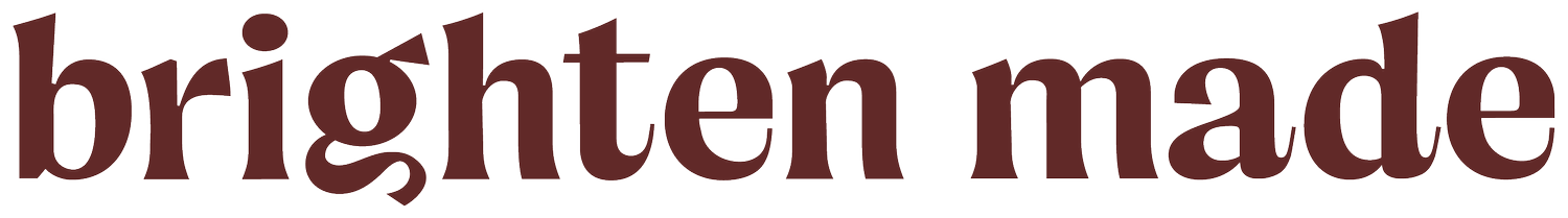
When I’m designing a primary logo, I love to take a big focus on type. Symbols and illustrated icons can be great within branding, but your primary logo needs to be, let’s face it, your name — and so we start with type! While every designer is different, here’s a little peek into my process and how I dive into creating original, custom primary logos.
Step 1 | Pen to Paper
I go back to the very basics and have often found putting pen to paper makes me the most inspired. I’ll begin sketching out ideas, writing out the letters in the logo I want to emphasize, discovering the possible connections I can make within certain letters, etc. I’ve found it’s a lot easier to realize possible design elements within a word I sketch first instead of just going straight to the computer.
Step 2 | Allllll the Research
This might be one of my fave steps cause I’m a font junkie. I usually start with the inspiration I pulled when I created my client’s brand strategy and then I let the internet take me down a rabbit hole of font foundries. Good places to start for this are Typewolf (fave), Youworkforthem, Pinterest, and MyFonts. I also try to test out alllllllll the fonts I already own which spoiler alert is a lot.
When it comes to presenting a final type selection to my clients, I’ve truly already gone through upwards of 20 different font ideas and combinations. By working through these font variations and ideas on my own and then presenting my client with ONE final idea, I’m able to spend time perfecting a solid concept vs. presenting three possible, mediocre ideas. I’ve also found that presenting one idea and one option is less overwhelming and results in a better experience for everyone in the long haul (more on that one-branding concept approach here!).
Step 3 | Letter Manipulation + Design
Last but definitely not least! We want to create something that’s more custom for our clients so that means not just selecting a font for a primary logo but instead changing it up and designing it into something truly one-of-a-kind. I dive into certain fonts or letters that I feel would be best for the brand. From there I copy, paste, rearrange, customize, and repeat! Sometimes I’ll hand-letter certain pieces of the brand in which case I’ll usually use my iPad and Apple Pencil.