A Case Study: Farmhouse Bath & Body Co.
9/27/24
recent work
a case study: farmhouse bath & body co.
design a timeless + sophisticated brand that helps bridge the gap from in-person markets to online sales — say no more.
Originally Graced Beauty, Farmhouse Bath & Body Co. officially started after owner LaVanda rebranded in 2020. With a belief that there had to be a cleaner way to make more natural products for our skin and homes, she created Graced Beauty. While Graced Beauty focused solely on skincare and body care, Farmhouse was going to take LaVanda’s love for natural, plant-based ingredients and bring them into the home fragrance space too.
Armed with the name change and a distinct goal to make sure her brand stood out from competitors, LaVanda reached out to us! She felt her DIY branding wasn’t portraying the right vibe for Farmhouse and was struggling with her website design. She wanted a brand that felt clean, bright, and cozy to target her customers and give her confidence as she used various assets across multiple mediums.
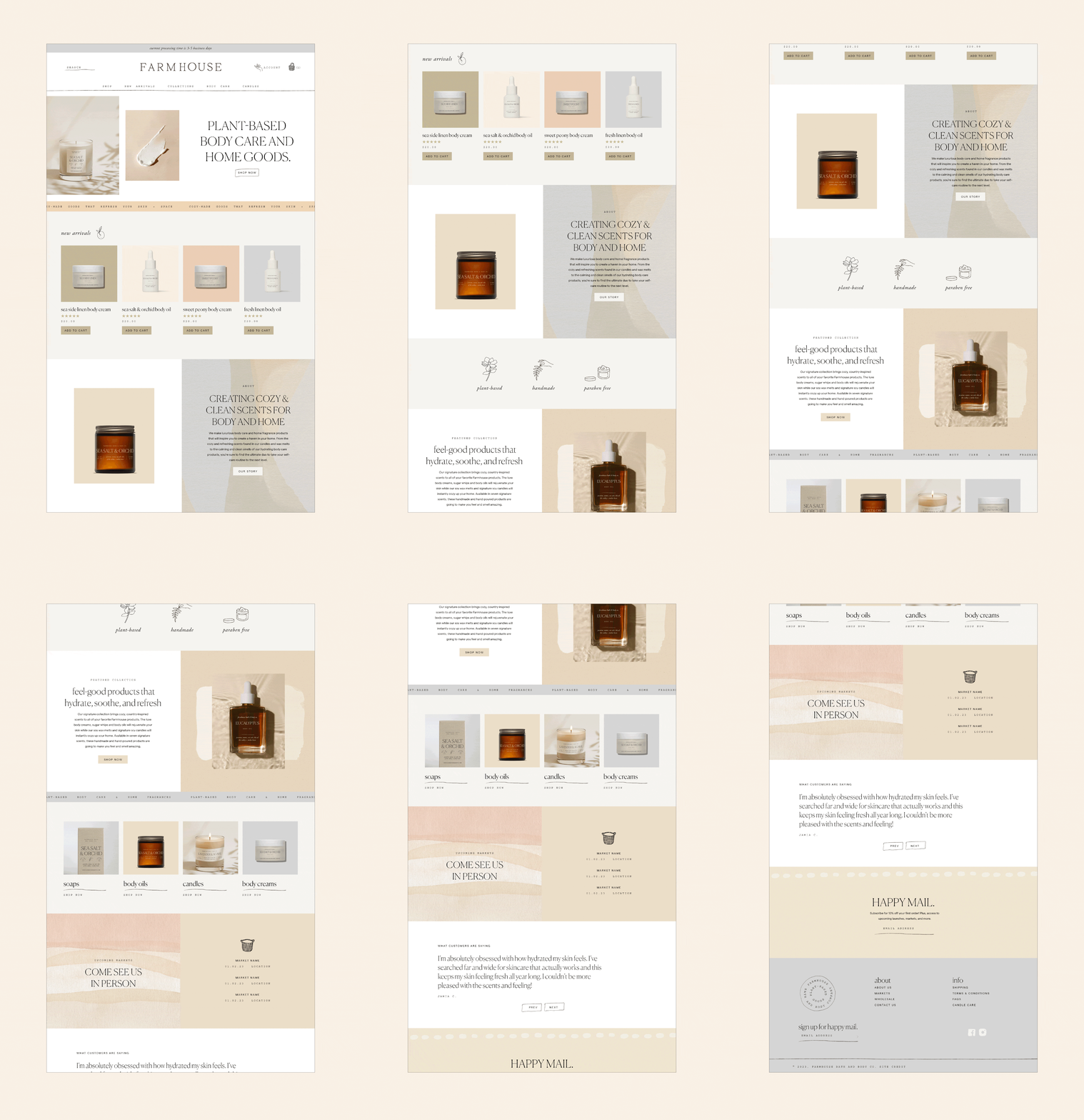
Through branding, messaging, a Shopify website design, full-site copywriting, custom product labels, and tonnnns of packaging, we created a cohesive branding experience to set LaVanda up for long-term success whether she was at an in-person market, making a sale online, or had someone shopping wholesale.
The Struggle
LaVanda had built a solid community of customers who loved her products and was even engaging with them at in-person events but she was struggling to create a cohesive brand from in-person to online. She needed solid branding to help her bridge the gap and help drive more online sales. While she loved attending in-person events and pop-ups, she was juggling working a full-time job and the business so she needed her website and online presence to do more of the work for her. On top of that, she wanted her branding to set her up for long-term success to wholesale her products too.
The Goal
A classic, cozy, and inviting branding experience that makes the Farmhouse audience feel inspired and excited about using clean ingredients on their skin and in their homes.
The Solution
With a business name like Farmhouse Bath & Body Co., we knew we had to lean into a timeless serif to help provide the classic, modern farmhouse vibe for LaVanda’s audience. We complemented the clean serif with hand-drawn elements and a script brand mark to lean into the handmade essence of the brand. By adding texture and raw touches, we were not only able to speak to the handmade quality of her products but we were able to evoke a feeling of intentionality and thoughtfulness too.
We leaned into soft, bright neutrals to further create that modern farmhouse look. While we always love a good neutral palette, we wanted to make sure there was a bit of color involved to help liven up the brand and make it memorable. We paired soft feminine colors with more saturated hues for contrast and added a soft blue-gray and sage color as a way to tie in a more earthy, timeless look that could also help speak to her natural, plant-based products.


