3 Tips for Formatting Your Text on Instagram and Anywhere Else
10/19/23
education
three tips for formatting text on instagram (and anywhere else)
a graphic designer’s how-to on social media.
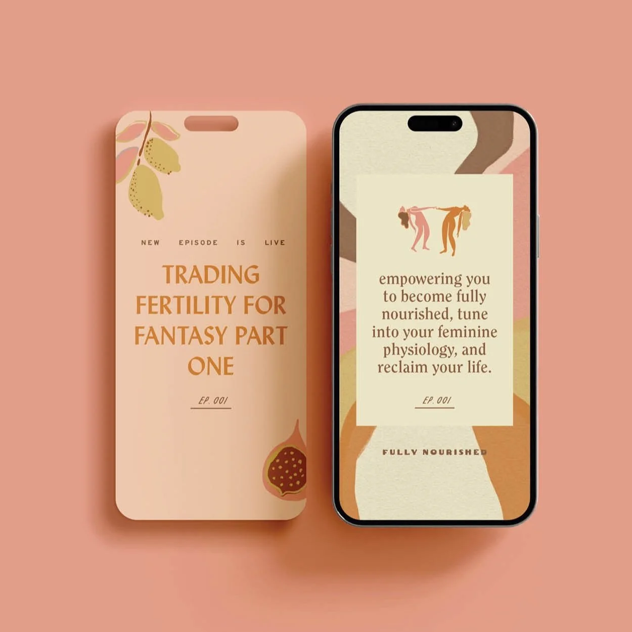
Let’s just start by saying this applies to ANY social media platform and any time you’re going to use text to create a graphic anywhere. Think of these rules when you go to create the cover of a PDF for example, a business card maybe, a thank you — you get the point. These three simple rules for formatting text are going to have your back time and time again no matter what you’re designing on and for.
tip 1 | text placement is everything
Keep your text away from the edge of the design, please! When the text sits next to the edge it creates visual tension and can be harder to digest.
The biggest mistake I often see is that the text is too large and too close to the edge of the composition! So when in doubt, make it smaller.
When deciding on if the text is centered, left-aligned, right-aligned, or justified, think through how your audience is digesting the information!
We naturally read from left to right, so aligning text on the left is always recommended for things like body copy. An easy hack to see if your text is easy to read is by actually reading it yourself! If you start to get a headache, you may need to adjust the size and placement.
While it might look cool to have your text justified because it allows for the column to be perfectly aligned, for example, it adds a lot of awkward spacing breaks in between the words. Here at Brighten Made, we might occasionally use justified text for a design element, but never anything that’s meant to be fully digested by the user.
When it comes to centering your text, we’re big fans of how it looks for things like headlines or larger statements, but we’d rarely ever recommend centering something like body copy because it makes the reader jump to different parts of the paragraph within each line.
Remember our brains are overloaded with digital information and design DAILY, so we want to keep things easy for our audience so they actually read and take in what we’re putting out.
tip 2 | line breaks, baby
After you type the quote into the text box, rework the line breaks of the paragraph. If you want to get extra fancy, make the first line wider, the second line narrower, and repeat. Lines that go in and out in small increments are visually more appealing. In design terminology, this refers to the ‘rag’ of the copy.
We’re also a big fan of avoiding widows around here! If you don’t know what a widow is (not just a woman with a deceased spouse), it means it’s the last word on its own line at the end of a paragraph. While we can’t control how the paragraph ends across the various screen sizes and variables on the web, we can control where the line ends on print material or other graphics such as Instagram post carousels.
The last thing you’ll want to consider when it comes to line breaks is if you’re a pro hyphen gal or not. I personally am anti-hyphen because I think it makes it trickier to read, but there are certain cases where breaking a word to the next line might be necessary. When in doubt, I recommend keeping the words together so that it’s easier for your audience to read!
tip 3 | negative space is a good thing
Going back to point number one, we want lots of breathing room around your text!
When you land on a website that has paragraphs upon paragraphs of text, are you inclined to read that or a short blurb with negative space around it? I’m guessing the latter. As long as people can read it, bigger isn’t always better. Remember that we want your audience to feel lessssss overwhelmed when they encounter your content, not more! Nothing will cause someone to x-out faster than seeing a boatload of text with nowhere for their eye to go.
If you’re like okay Bri, but I have so much text to fit in such a small space… I want you to ask yourself these three questions!
Is there part of the copy that can be cut or reworked to say the same thing in fewer words? (Side note: we have a fabulous copywriter on our team who can help with any and all copyediting if you partner with us for things like your site!)
Can you break up the text in a way that makes it easier to read? Think headlines, subheadings, CTAs, and body copy!
We’re big fans of hierarchy over here. So instead of a giant block of text, what if you broke it out into a headline that summarizes what the copy is about and draws the user in? Subheadings are another alternative to support the headline text, and thennnnn dive into the body copy!
When it comes to your website, you can use things like collapsible tabs so that if someone is interested in reading more they can expand the box to finish reading. This helps with having them feel LESS overwhelmed while still providing them with value.
Remember that negative space does wonders when it comes to allowing your users’ eyes to feel at peace when coming across your content. I think our gut instinct is to always fill the space with more, more, and more but in design, less is more, always.

