What’s an Illustration and Why Your Branding Needs Them
10/12/23
Design
what’s an illustration and why does your branding need them
Welcome to Design School with Bri — illustration edition.
If you’re new here you might not know this but I like to go ALL OUT for our branding clients. This means we provide a full branding experience that includes more than just a logo design but also supporting elements such as custom illustrations and patterns. While not every branding client needs illustration per se, some can really benefit by using it! Here’s why — our brains process pictures, symbols, and other visuals faster than words so illustration can help convey a brand message more efficiently with our already short attention spans.
With that being said, I’d like to officially welcome you to Design School with Bri: Illustration Edition where I’m going to walk you through #allthings illustration starting with the very basics.
What’s an Illustration?
I told you we were taking it allllll the way back to the very basics didn’t I? So what’s an illustration? By the literal definition, an illustration is a picture or diagram that helps make something clear or attractive. When it comes to branding, an illustration is going to be a drawing or symbol that relates to your overall brand. It’s going to help us quickly convey something we might not otherwise be able to do with words.
A quick example of how you could incorporate illustrations into your brand includes illustrating your products or the materials that make up your product. For example: a shoe brand could show sketches of the different types of shoes they sell or an activewear brand (like GNGR Bees!) could illustrate items that are recycled and made into their clothing. On the other hand, your brand illustrations don’t have to be literal either. They could be more abstract ideas such as illustrations that represent your core values, mission, or the overall vibe you’re trying to create. An example here would be icons that represent sustainability or handmade, woman-owned products in your boutique, or illustrations of people to represent diversity and community.
At a glance, an illustration is going to be able to convey a certain feeling within your brand. Is your brand playful? Sustainable? Modern? Artisanal? We can convey all of that and more just through illustrations.
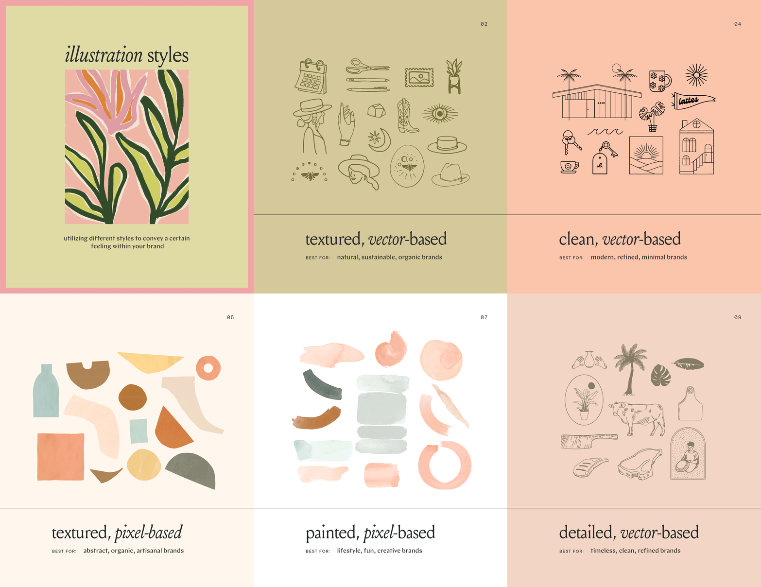
Now with illustrations, there are two different ways we can approach them! Vector and pixel-based. A vector illustration is just a fancy way to say that the illustration is based on a mathematical formula that allows it to be as large as you need it to be without ever compromising the quality. A pixel-based illustration means that it’s made up of pixels, like a photograph. So if you blow this up to be 20 feet tall, it’ll lose clarity and start to appear fuzzy.
When it comes to selecting an illustration approach, the two have various pros and cons! With vector illustrations, it’s easy to swap colors and scale, while pixel-based illustrations provide a texture and depth that vector just can’t. Unless your brand is Nike and you plan to have billboards, either option is safe for an online business.
Illustration Styles
Now that we’ve covered the basics and even talked about vector vs. pixel-based illustrations, let’s dive into a few different illustration styles, whether they’re pixel-based or vector, annnnd talk about the general style of brands they’re best for. When it comes to which illustration style is best for your brand, we ultimately think about the feeling and message you’re trying to portray within your branding, and depending on how the illustration is used (colors, size, etc.) it can also drastically change the feeling it conveys.
While illustration can be an amazing tool to quickly convey your message, it also has the ability to cheapen a brand really quickly if it’s not done the right way. For example, when you think of Microsoft Word and the clip art that comes with it, you often cringe a little inside, right? Or that might just be me… Our goal is to use illustration in a way that ELEVATES your brand, which is where the style of illustration can really come into play. Utilizing a sketch of your jewelry that is raw, detailed, and has a handmade quality to it will help convey a handmade, artisanal feeling, whereas a stock art clip of a necklace will come across as cheap and inauthentic. So let’s dive deeper into the various illustration styles we have used over the years and how each tells a different story.
Why you shouldn’t use Canva or Creative Market for illustrations
I truly don’t have anything against Canva or Creative Market and in fact, I think they’re both SUCH a great resource for businesses that are just starting out. With that being said, when it comes to your branding you want to create a one-of-a-kind, memorable feeling that makes a lasting impression on your target audience and I think that can be challenging when you’ve pulled an illustration from Canva or bought one from Creative Market. These resources, while great, are accessible by everyone so that charming hat illustration you want to use for your e-commerce brand could already be in use by dozens of other brands similar to yours. Instead, a custom illustration is going to be completely unique to you and therefore stand out among the sea of other brands.


