frankie & claude
SCOPE OF WORK: Branding, Messaging, Web Design, Copywriting, Collateral
VIBE: refined, whimsical, elevated, playful, inviting
industry: gifts
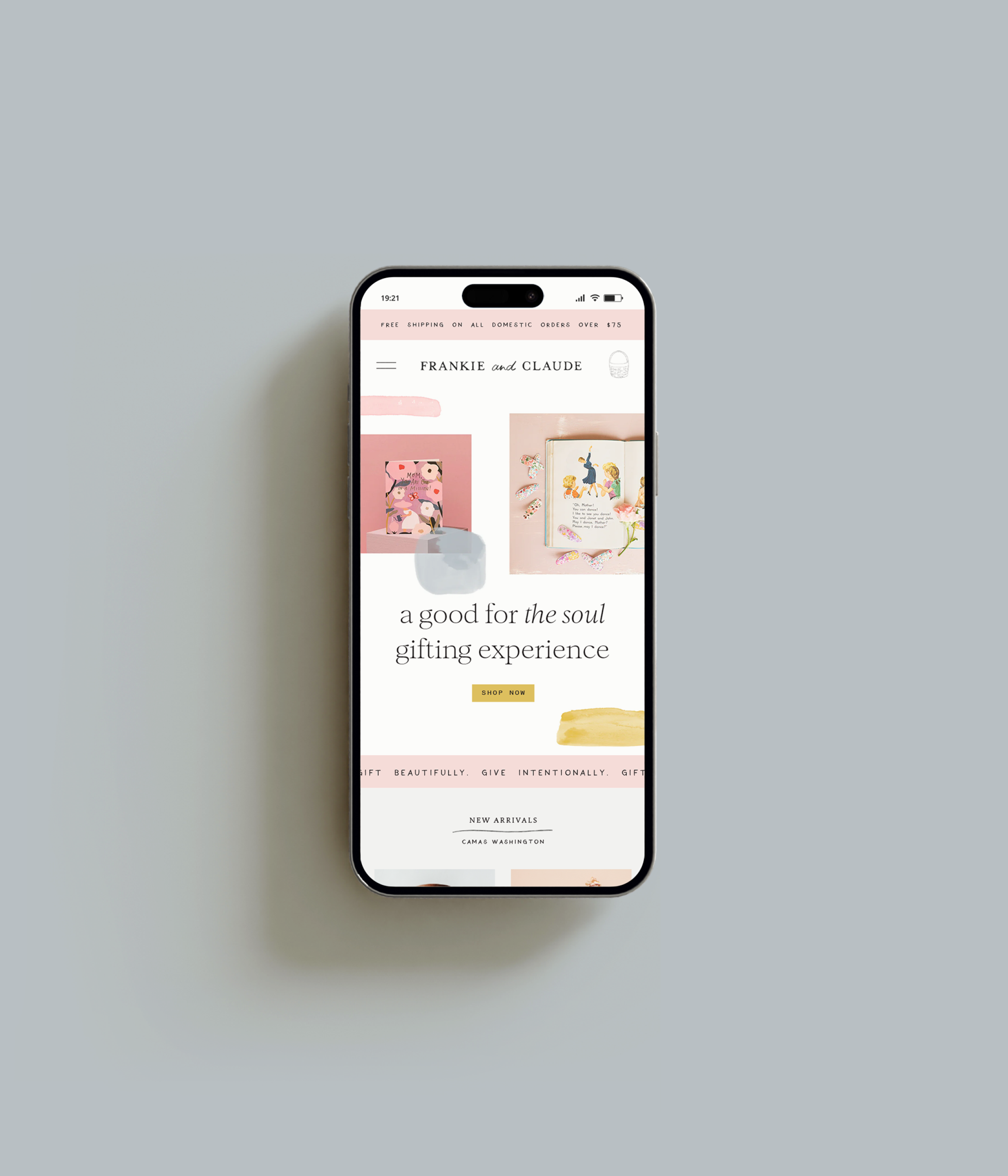
After a rebrand in 2017 left Sam feeling like her brand and website were a little lackluster, she reached out to Brighten Made in hopes of putting more emphasis on her retail sales to balance out her revenue streams. She wanted to put more effort into her Shopfiy site as well as her email and social media marketing but needed a dynamic and engaging brand identity to get her started. By creating a full branding experience we were able to give Sam the tools she needed to market her business and the confidence to do it proudly!

about
Frankie and Claude is a stationery and lifestyle brand designed to celebrate all of life’s moments, big and small, based out of the Pacific Northwest.
brand goal
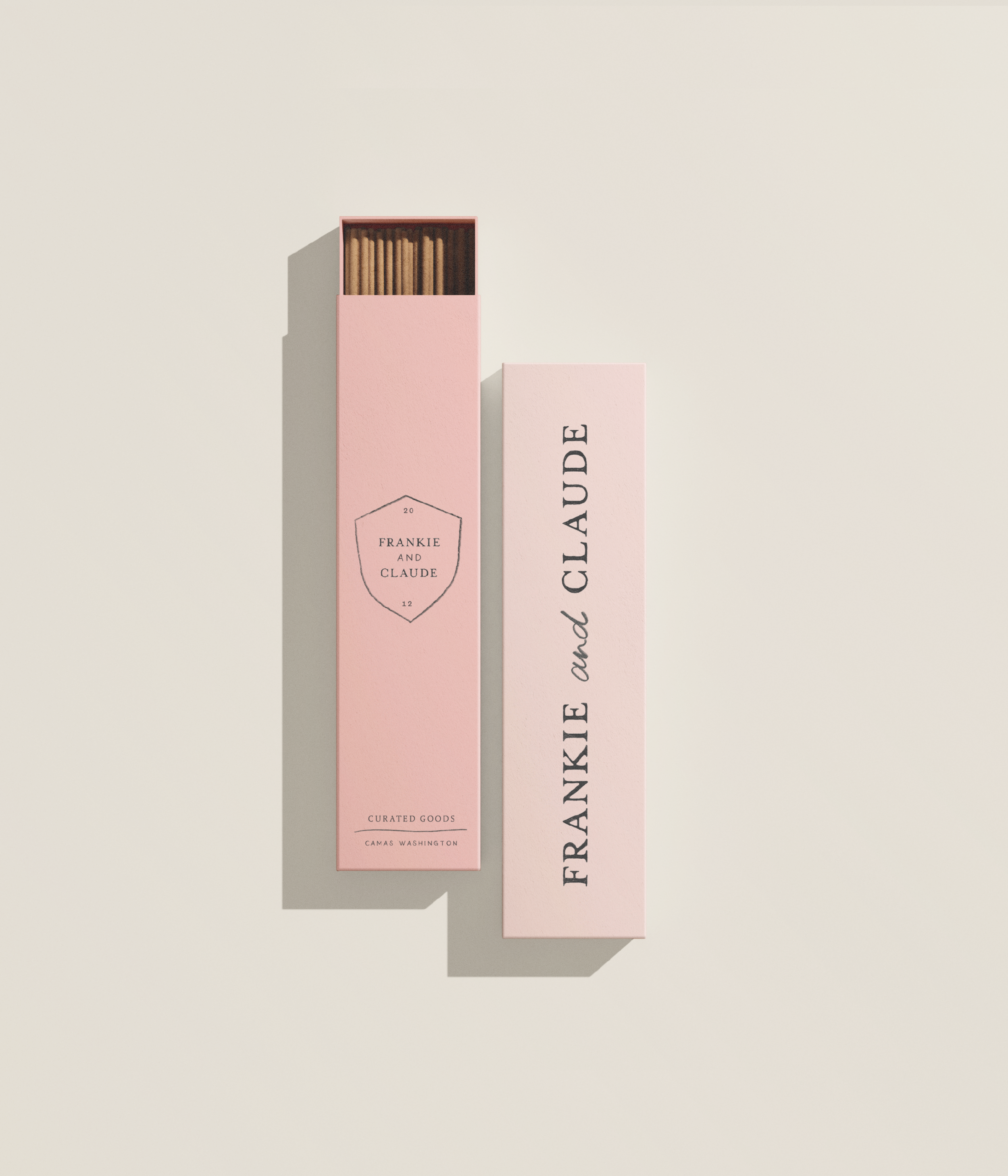
A classic, feminine, and playful branding experience that makes customers feel joy through Frankie & Claude’s thoughtfully curated stationery and gifts.
DESIGN HIGHLIGHTS
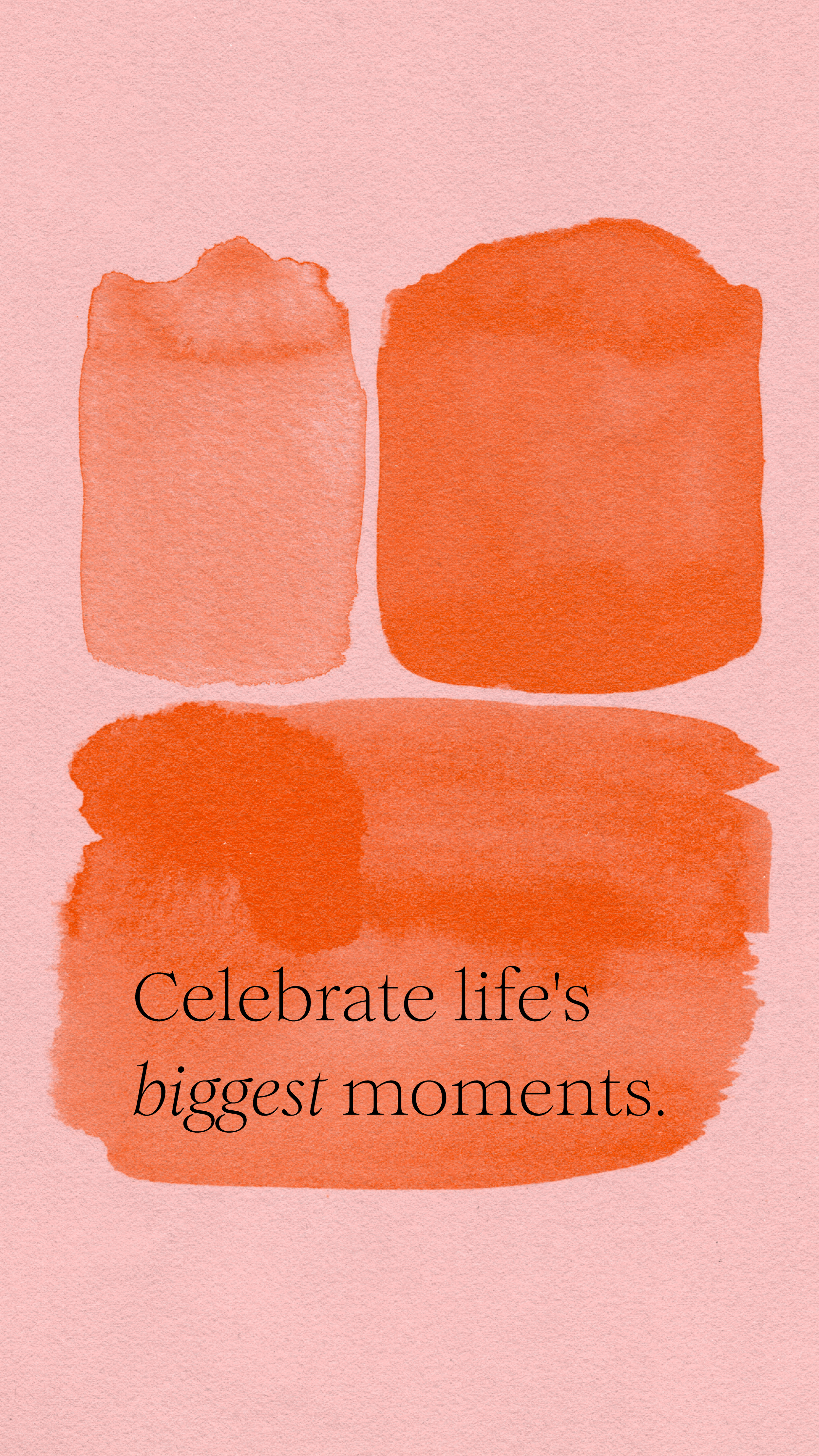
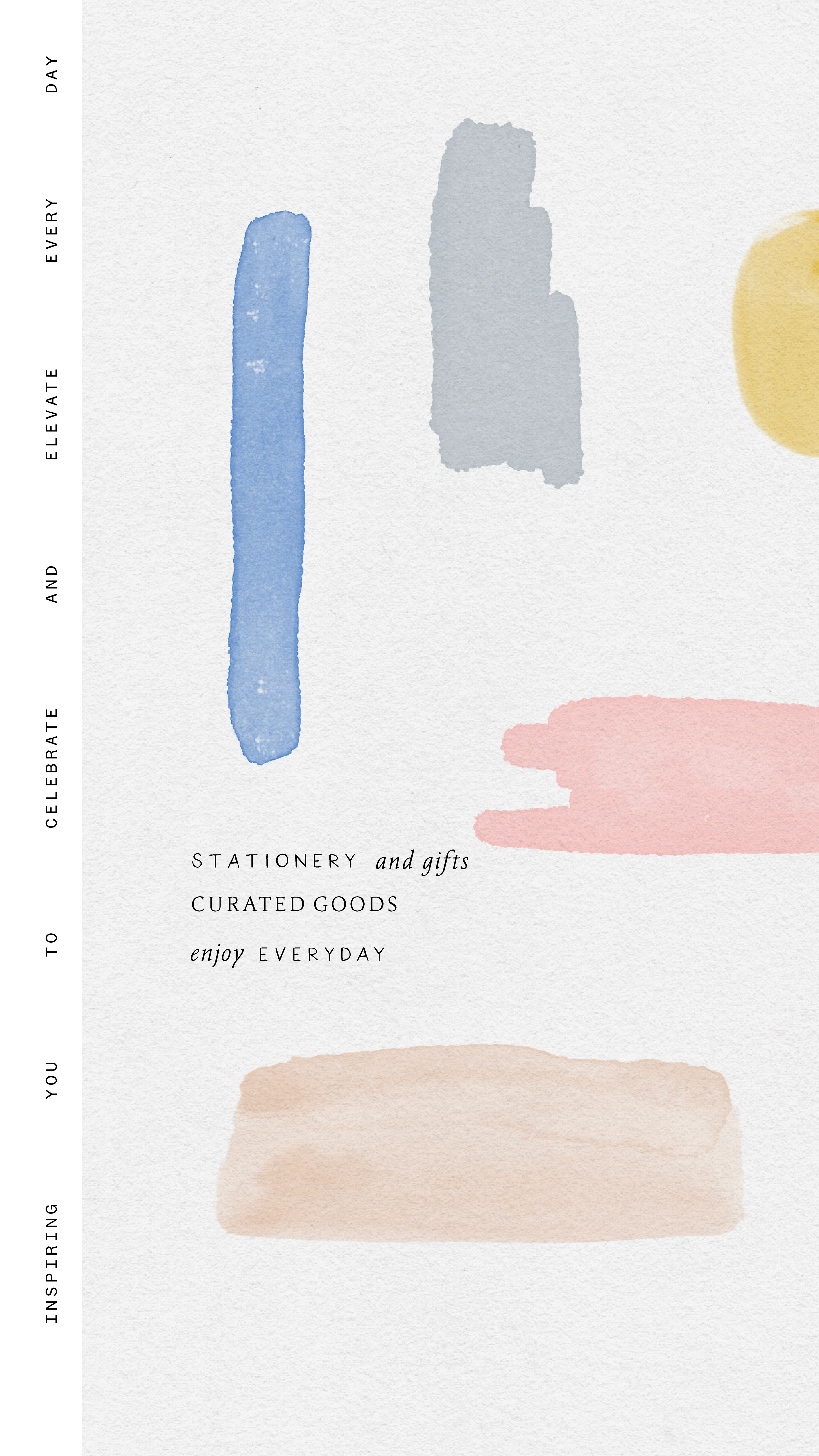
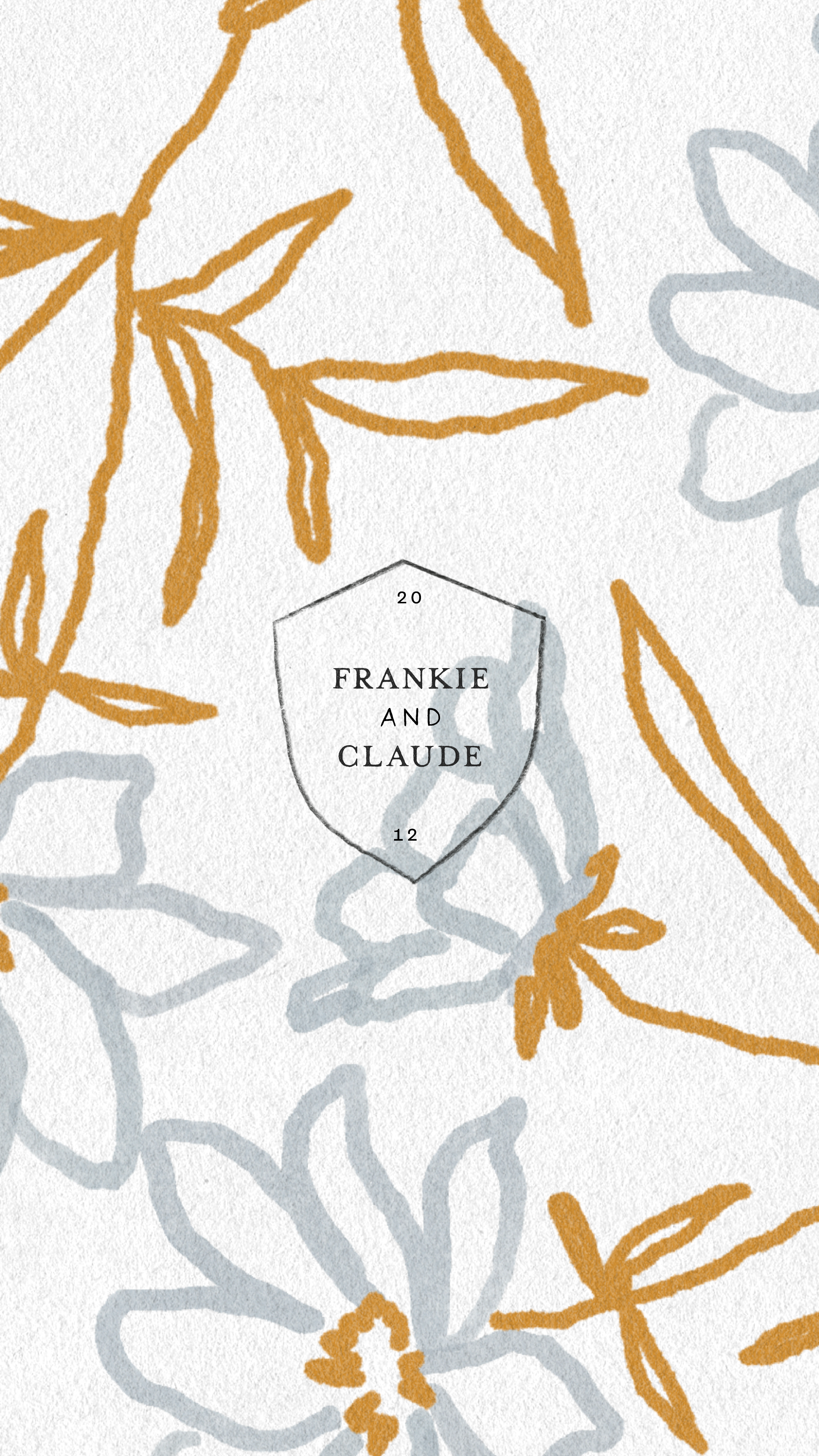
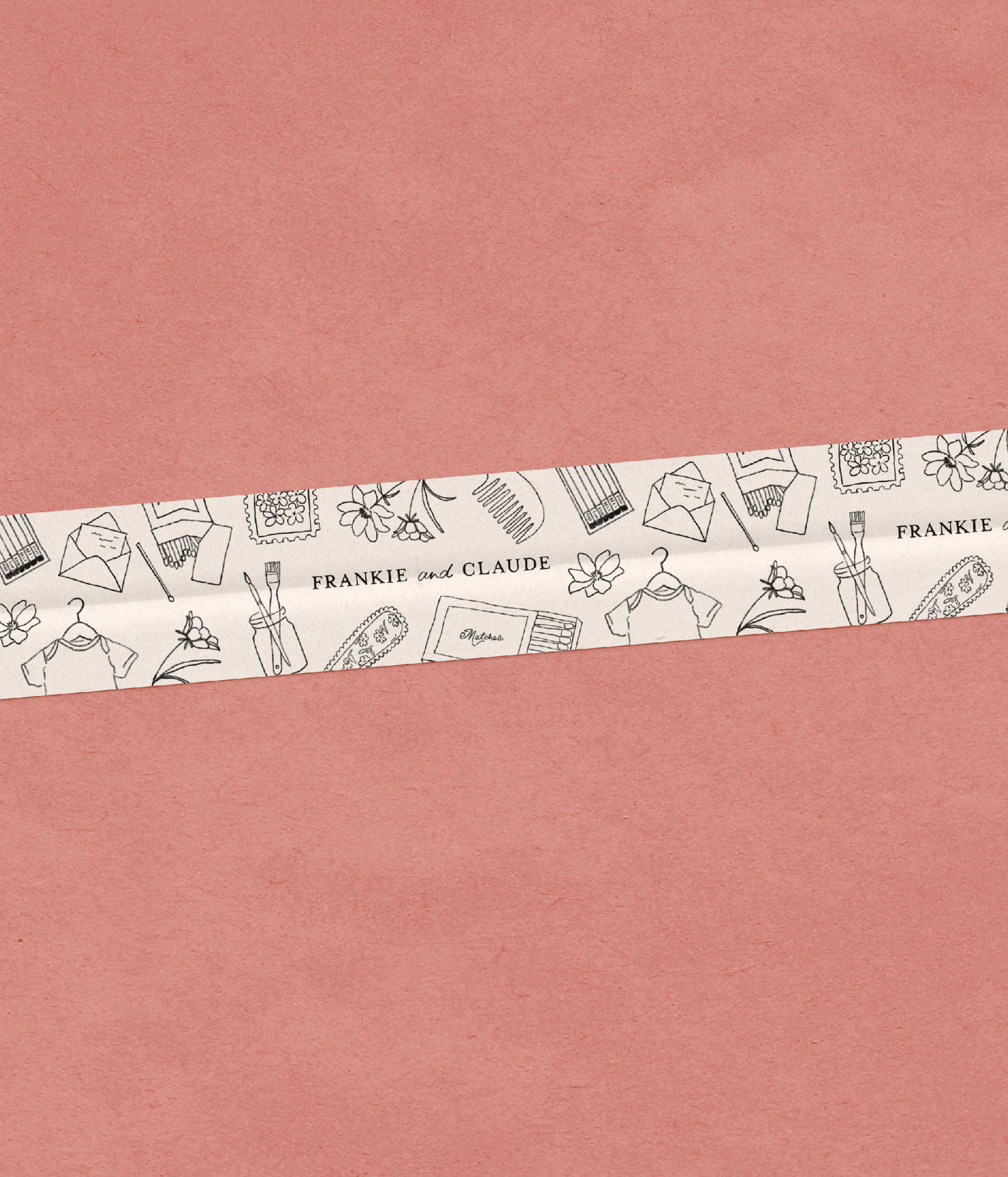
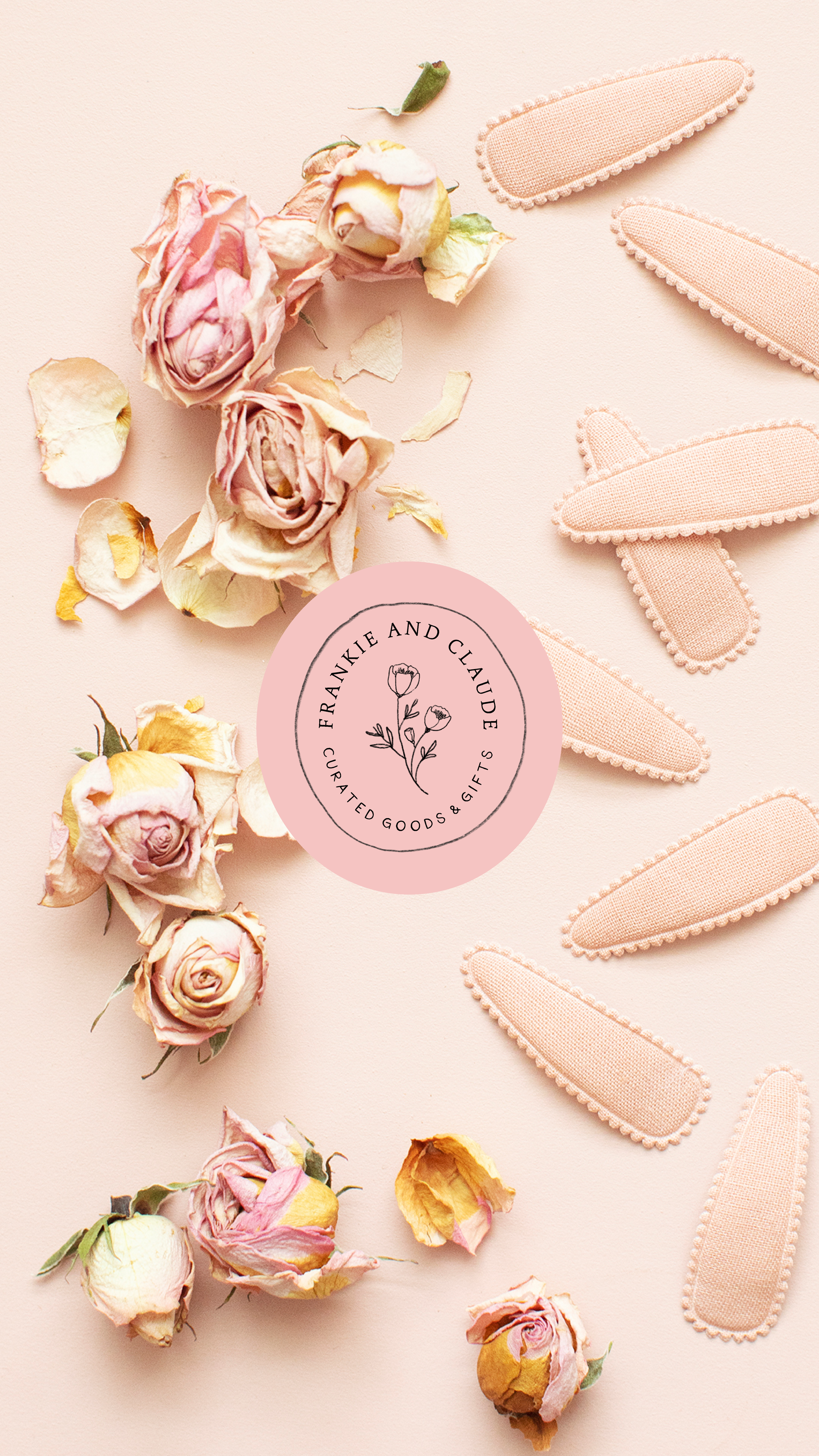
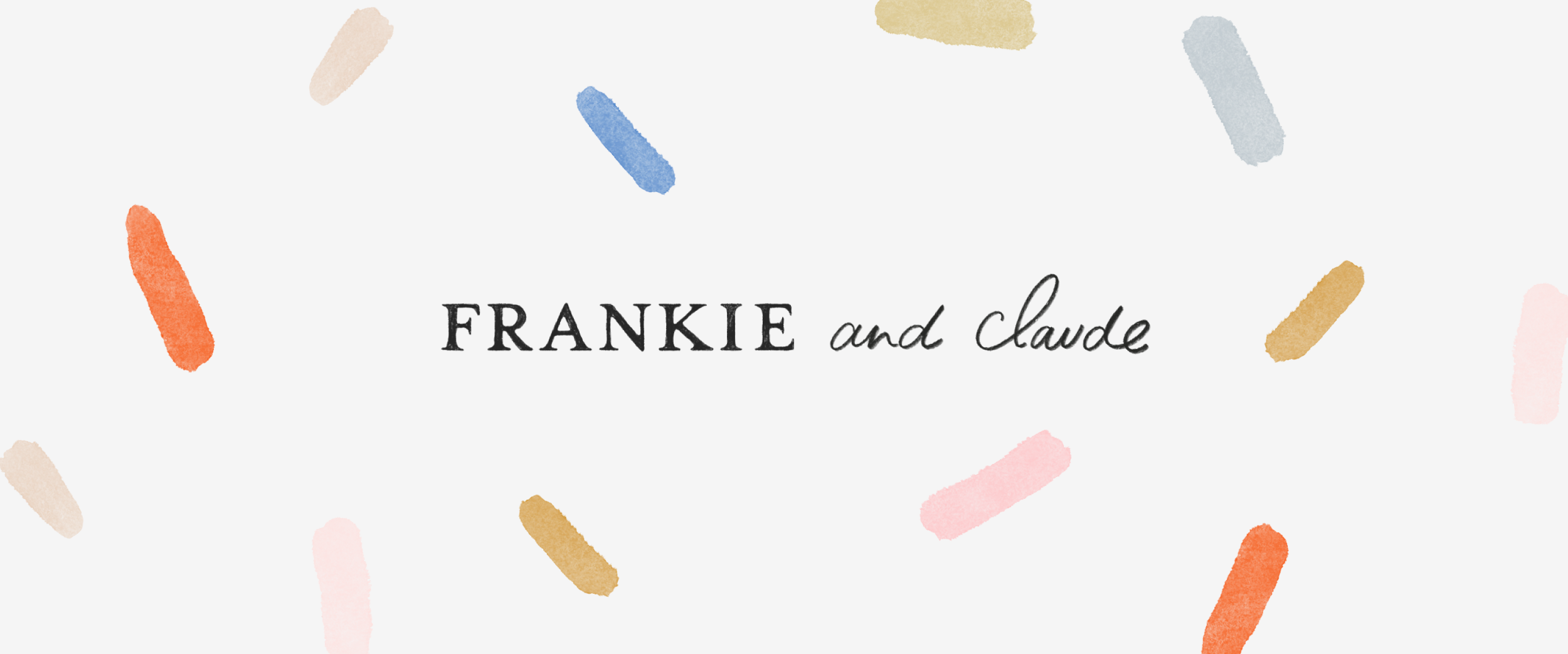
To stand out from competitors who mostly stick to a black-and-white color palette or soft neutrals, we set Frankie and Claude apart by introducing more color to the branding. We leaned into pinks to create a feminine touch and further complemented that with pops of indigo, scarlet, and gold to create a brand identity that felt elevated and timeless while also evoking a happy and upbeat feeling.
KIND WORDS
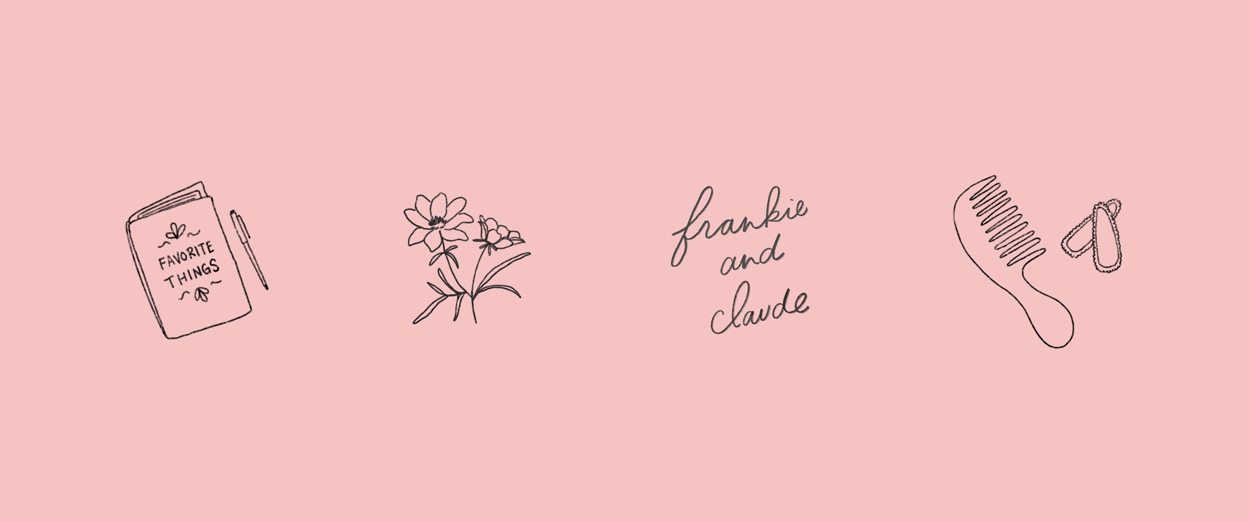
I am loving it! I’m really happy with the logo and brand marks! I love the subtle texture and the use of the serif. You are definitely right about adding pops of color in the color palette, and I am not at all against it. You are spot on about adding color to the palette to convey the happiness, joy, and playfulness of the brand. The illustrations are all so cute too!
