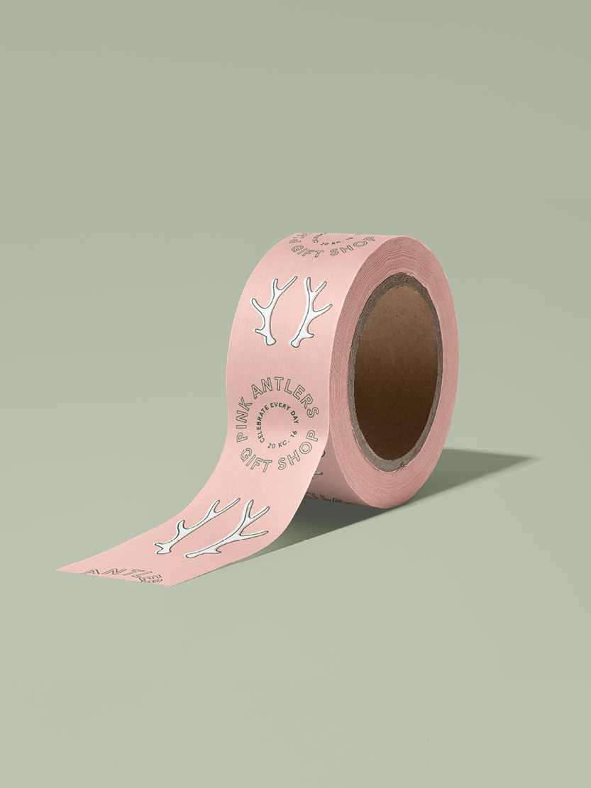
pink antlers
SCOPE OF WORK: Branding, Web Design, Packaging, Collateral
VIBE: playful, colorful, unique, bold, classic
industry: gifts
The mother-daughter duo behind Pink Antlers came to us in search of a rebrand to make their marketing, website, in-store experience, and social media all more cohesive. By providing a distinct primary logo, secondary logos, and brand marks as well as rounding out the branding project with patterns and illustrations, we created a niche brand identity with elements that could easily be integrated across all channels.


Brand Goal
A modern and fun yet timeless branding experience that makes your audience feel inspired to celebrate each day.


design notes
To bring in a playful touch we used abstract patterns and illustrations to communicate the feeling of celebration. By having a variety of party and decor elements illustrated we were able to create a great asset for marketing materials and the website design to showcase the wide range of product offerings Pink Antlers has while still maintaining a cohesive look.


KIND WORDS
Thank you!! We love how everything turned out! It’s beautiful! Thanks again for all you put into our brand!

